
Definition
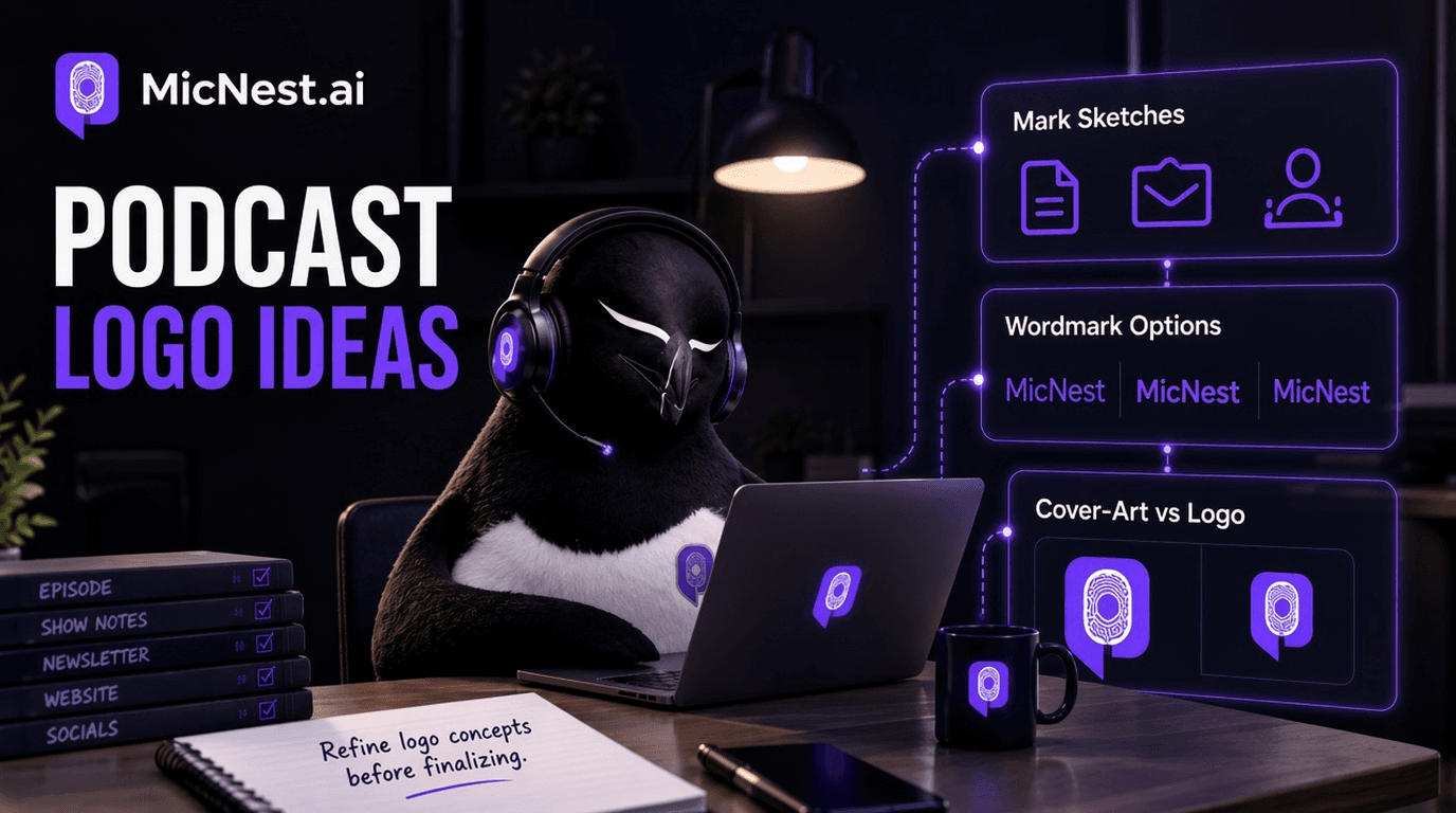
podcast description: Podcast logo ideas are simple visual marks or wordmarks that identify a show across cover art, social, a website, and guest materials. A strong podcast logo stays recognizable at small sizes and matches the show promise.
In simple terms: Podcast logo ideas are simple visual marks or wordmarks that identify a show across cover art, social, a website, and guest materials. A strong podcast logo stays recognizable at small sizes and matches the show promise.
Quick Answer
Start with one clear concept tied to your niche and name. Prefer a bold wordmark or a one-shape mark over detailed illustrations. Use high contrast and two or three colors. Test at
Start with one clear concept tied to your niche and name. Prefer a bold wordmark or a one-shape mark over detailed illustrations. Use high contrast and two or three colors. Test at about 150 by 150 pixels. Keep the logo consistent with cover art, not a second competing scene.
MicNest turns clear show promises into searchable episode pages and a destination that matches your description. Start at https://app.micnest.ai/auth/signup.
Key Takeaways
- ➔ Logo and cover art are related jobs, not identical files.
- ➔ Readability at thumbnail size beats clever detail.
- ➔ One idea, few colors, bold type.
- ➔ Skip the default mic and waveform cliché unless that is the topic.
- ➔ Test small before you print stickers.
- ➔ Consistency across apps, site, and clips builds recognition.
- ➔ You can launch with a clean temporary mark and refine later.
- ➔ Branding is the system; the logo is one piece of it.
People hunting podcast logo ideas usually want something that looks “pro.” What they need first is something strangers can recognize when it is the size of a postage stamp.
App shelves punish busy art. Tiny type disappears. Generic mics blend into every other show. A logo that only looks good on your laptop wallpaper fails the only test that matters: can someone spot you while scrolling?
This guide separates logo from cover art, gives idea directions that stay simple, and shows a quick test loop before you lock the brand.
1. Logo vs Cover Art vs Thumbnail
Hosts mix these up constantly.
| Asset | Job |
|---|---|
| Logo / mark | Instant recognition in small spaces |
| Cover art | Square shelf presence in podcast apps |
| Social / YouTube thumbnail | Episode-level click bait with room for more type |
Your cover can include the logo. Your logo should also work alone on a mug, a website, a guest page, or a watermark.
If the only version of your “logo” is a full cover scene, you will struggle every time you need a small icon.
2. Idea Directions That Scale Down
Steal a direction, not a copy of someone else’s art.
Wordmark
Show name in one bold sans or slab font. High contrast. Optional underline or bar. Works for most talk shows.
Lettermark
One or two initials in a simple shape (circle, rounded square, badge). Good when the full title is long.
Single symbol
One metaphor for the niche: a route pin for local news, a wrench for operators, a speech bubble for interviews. Keep it one shape.
Name + small symbol
Wordmark with a tiny mark that still reads when the symbol alone is used as a favicon.
Color-block identity
Flat color field + big type. Many top shows win with almost no illustration.
Avoid stacking faces, long taglines, city skylines, and five fonts. Those die at small size.
3. Rules Before You Open Canva
- Write the show promise in one sentence first.
- Pick two main colors and one accent.
- Choose one typeface family for the mark.
- Design for the center of the frame; edges get cropped in some UIs.
- Leave padding; do not kiss the border.
- Export masters as vector or high-res PNG.
- Check contrast on both light and dark app themes.
Reddit advice keeps repeating the same bar: if it fails at roughly 150×150, it fails in the wild.
4. Clichés to Skip (Usually)
- Floating microphones and headphones as the whole concept
- Audio waveforms as decoration
- RSS icons
- Tiny taglines under the title
- Busy photo backgrounds with low contrast text
- Script fonts for the main name
Exceptions exist if your show is literally about gear or audio engineering. Even then, make the name win.
5. A Fast Ideation Loop
Spend one hour, not one month.
- List 10 words tied to the niche (not “podcast”).
- Circle three that could become a shape.
- Sketch five ugly thumbnails on paper.
- Build two digital options (wordmark + symbol).
- Drop both into a phone screenshot of a podcast app.
- Ask two people outside your team: “What show is this for?”
- Keep the one they can describe from memory.
If they say “the purple one with big letters,” you are closer than “the detailed illustration with the tiny mic.”
6. Fit the Logo Into the Wider Brand
A logo without a system still feels random.
Align:
- Cover art layout
- Episode title style on video or clips
- Site header
- Guest booking one-sheet
- Trailer end card
That is podcast branding in practice: same promise, same colors, same mark. You do not need a 40-page brand book. You need repetition.
When you refresh art later, change carefully. Recognition compounds. Frequent swaps reset it.
7. DIY vs Designer
DIY is fine when:
- Budget is near zero
- You can commit to bold simplicity
- You will test at small size
Hire help when:
- Your current art looks sketchy and you have proof it hurts clicks
- You need a vector system for merch and partners
- You keep overdecorating every Canva draft
A cheap custom mark that is simple beats an expensive collage that is busy.
8. Common Mistakes
Treating cover art as the logo. You will need a small mark eventually.
Designing only at full screen. Always shrink the draft.
Too much story in one square. One idea per mark.
Matching a celebrity show’s style with no angle. You inherit their comparison set.
Invisible type on busy photos. Contrast first.
Launch delay for perfect branding. Ship a clean temporary system; refine when the show is real.
9. Checklist Before You Lock It
- [ ] Readable at ~150×150
- [ ] Name spelling is correct and large enough
- [ ] Works in color and as a single-color version
- [ ] Distinct from the top five shows in your category
- [ ] Matches the niche promise
- [ ] File exports ready (square cover + transparent logo)
- [ ] Used consistently on site and social avatars
Pass that list and you are ready to stop tweaking.
10. How MicNest Fits
A logo helps people recognize the show. Keeping them means episodes still have a home: pages, notes, and a site that carries the same mark after the app scroll ends.
MicNest helps turn episodes into owned pages so the brand you just simplified stays visible outside the directory row.
Frequently Asked Questions
Do I need a logo and cover art?
You need square cover art for apps. A separate simple logo helps everywhere else. Many covers include the logo as the main element.
What are the best podcast logo ideas for beginners?
A bold wordmark or lettermark with high contrast. Add one simple symbol only if it still reads small.
Should my face be in the logo?
Rarely in the tiny mark. Faces can work on cover art if the title stays readable.
Can I use Canva for a podcast logo?
Yes for a clean launch mark. Keep it simple and export the largest size you can. Move to vector later if you scale.
How is a podcast logo different from a YouTube thumbnail?
Logos are stable brand marks. Thumbnails change by episode and can hold more text and faces.
When should I redesign my podcast logo?
When it is unreadable, off-niche, or actively confusing. Not because you are bored in week three.
Do colors matter more than shapes?
Both matter. Contrast and simplicity matter more than either alone.
Can a text-only cover work as a logo system?
Yes. Many strong shows are basically a wordmark on a color field.
Final Takeaway
Good podcast logo ideas are less about decoration and more about recognition under pressure.
One clear mark. Few colors. Type that survives the shrink. Cover art that cooperates instead of competing. Test small, then repeat the same system everywhere.
If strangers can spot you in a crowded shelf, the logo did its job.
Related reading
Before vs after
Before
- - Lead with biography and adjectives
- - Stuff keywords at the bottom of the description
- - Reuse one vague blurb on every episode
After
- + Lead with audience and outcome in the first lines
- + Write specific episode descriptions with guest and topic
- + Keep description, name, and titles saying the same thing
Who is this for?
Hosts rewriting vague show bios
Creators whose feed copy does not match the show.
New shows before launch
Hosts writing the first show description and trailer package.
Episode publishers
Hosts who paste the same blurb under every episode.
Make the first lines earn the play
Write a show and episode description strangers can skim in seconds, then keep titles and pages aligned with the same promise.
Explore MicNest or start freeFrequently Asked Questions
Do I need a logo and cover art? +
You need square cover art for apps. A separate simple logo helps everywhere else. Many covers include the logo as the main element.
What are the best podcast logo ideas for beginners? +
A bold wordmark or lettermark with high contrast. Add one simple symbol only if it still reads small.
Should my face be in the logo? +
Rarely in the tiny mark. Faces can work on cover art if the title stays readable.
Can I use Canva for a podcast logo? +
Yes for a clean launch mark. Keep it simple and export the largest size you can. Move to vector later if you scale.
How is a podcast logo different from a YouTube thumbnail? +
Logos are stable brand marks. Thumbnails change by episode and can hold more text and faces.
When should I redesign my podcast logo? +
When it is unreadable, off-niche, or actively confusing. Not because you are bored in week three.
Do colors matter more than shapes? +
Both matter. Contrast and simplicity matter more than either alone.
Can a text-only cover work as a logo system? +
Yes. Many strong shows are basically a wordmark on a color field.

